Professional Trajectories - Computer Arts Comp
- Megan Pearce Wright
- May 23, 2019
- 2 min read
After what felt like going round in circles, and endlessly scrolling through instagram I came across a call out for Computer Arts Magazine Competition. Calling out students or recent graduates to answer their brief for their cover, for their 'New Talent' issue. Showcasing new and inspiring creatives graduating and entering the industry this year. This was my golden ticket/ light bulb moment. It gave me the chance to try and gain exposure on a well known and respected publication within the design industry. It would definitely be a nice addition to my portfolio. I set about researching past winners and covers that I liked from recent or past issues and annotated them.

Brainstorming my ideas around ‘New Talent’
I wanted to have fun and to not take the concept of new talent so literally. I wanted to play around with ideas such as:
That new designer Febreeze
One small step for a graduate one giant leap for the design industry.
A little fish in a big pond
The visualisation of a new designers brain compared to an old designers brain (still works and has ideas, but just doesn’t look at the world the same)
Literal definition of someone saying - HIRE ME
Diversification and representation in the creative industry - characters / People
A tri-cycle with out training wheels.
Shiny and un-tarnished visual comparison
The idea of glitching and distorting the industry.

I explored a variety of ideas and different avenues using the different insights above. I started to sketch and visualise how the insights could translate design wise and communicate the message effectively.


From here I looked at synonyms for the word new to try and push the insights further. I looked on websites such as Behance and Dribble to try and find inspiration for development.

I looked at the work by @Memovigil and explored glitching and type, and the metaphors of shaking up the industry as a new not seen before angle. For something to be new something must be broken to replace. Going along those lines I began researching glitching and displacement and came across this account on instagram . @Memovigil's work is mesmerising and enchanting but also equally aesthetically pleasing. I was inspired to create my interpretations following along the brief set by Computer Arts.

I explored this by creating vectors out of type in illustrator and then placing them into after effects. I was then able to distort the font and make it animated. However, this didnt really look great as it was. I wanted to try and create a gif pack as I have wanted to do this before to create for instagram. I researched into how to make the GIFs, created an account with Giphy and uploaded the video I made in after effects. I was then able to distort the design further and speed the footage up. I was able to produce multiple outcomes from this experimentation.


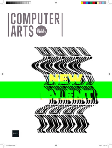


I liked this style however I did want to push the concept further. I experimented with the typography in a 3D format. That meant I could play around with perspective, shadows and additional elements.
